
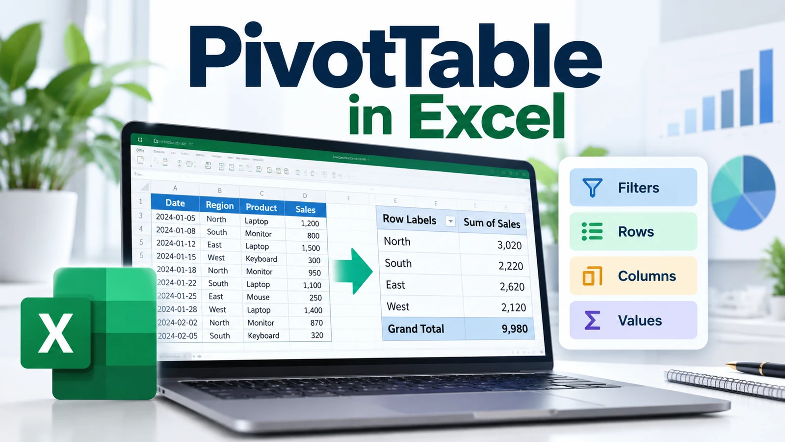
Learning how to create a PivotTable in Excel is one of the fastest ways to turn a long list of rows into a compact, useful summary. Instead of writing many formulas manually, you can group, count, sum, compare, filter, and reorganize data by dragging fields into a report layout.
This step-by-step guide shows you how to create a PivotTable in Excel, how to organize the Rows, Columns, Values, and Filters areas, how to refresh the report when source data changes, and how to avoid the most common mistakes.
If you are still learning spreadsheet fundamentals, start with our Excel for Beginners guide. For a broader learning path, visit the Microsoft Excel Learning Hub, and for calculations outside PivotTables see our Excel Formulas and Functions guide.
For official product references, Microsoft provides a guide to creating PivotTables, an overview of PivotTables and PivotCharts, and instructions for refreshing PivotTable data.
What Is a PivotTable in Excel?
A PivotTable is an interactive summary of a dataset. It does not normally change the original source data. Instead, it creates a separate report that lets you reorganize information to answer questions such as:
- How much revenue came from each region?
- How many tasks are Open, In Progress, or Complete?
- What is the total budget by department?
- Which project has the largest number of risks?
- How did monthly sales change over time?
Microsoft describes PivotTables as a tool for calculating, summarizing, and analyzing data to reveal comparisons, patterns, and trends. The key advantage is flexibility: you can move fields between report areas without rebuilding the source table.
How to Create a PivotTable in Excel: When to Use It
PivotTables are especially useful when your source data contains many rows and repeated categories.
Typical examples include:
- Sales transactions
- Project action logs
- Risk registers
- Support tickets
- Inventory movements
- Survey results
- Expense records
- Operational KPIs
If you only need a simple total, a formula such as SUM or SUMIFS may be enough. If you need to explore the same dataset from several perspectives, a PivotTable is often more efficient.
How to Create a PivotTable in Excel: Prepare Your Data First
Good source data is the foundation of a reliable PivotTable. Microsoft recommends organizing the data in columns with a single header row.
Use One Header Row
Each column should have a clear field name, such as:
Date
Project
Owner
Region
Status
Budget
Actual Cost
Avoid blank header cells because Excel needs field names to build the PivotTable Field List.
Keep One Type of Data Per Column
A Date column should contain dates. A Budget column should contain numeric values. A Status column should contain labels such as Open, Closed, or At Risk.
Mixing data types can make grouping and summarizing less predictable.
Avoid Blank Rows Inside the Dataset
Blank rows can break the logical structure of the source range and make it easier to select incomplete data.
Use an Excel Table When Possible
Converting the source range into an Excel Table makes the dataset easier to maintain as rows are added.
Select the data and use:
Insert > Tableor, on many desktop versions:
Ctrl + TUsing a Table also gives you readable field names and a source that can expand as you add new records.
How to Create a PivotTable in Excel Step by Step
Step 1: Select the Source Data
Click anywhere inside your dataset or Excel Table.
If your data is a normal range rather than a Table, make sure the entire relevant range is included and that the first row contains headers.
Step 2: Insert the PivotTable
Go to:
Insert > PivotTableExcel opens the Create PivotTable dialog and identifies the selected table or range.
Step 3: Choose Where to Place the PivotTable
You can normally place the PivotTable in:
- New Worksheet — often the cleanest option for analysis.
- Existing Worksheet — useful when building a dashboard or summary page.
Select your preferred location, then confirm the creation.
Step 4: Use the PivotTable Field List
Excel displays the PivotTable Field List. This is where you choose which fields appear in the report and how they are used.
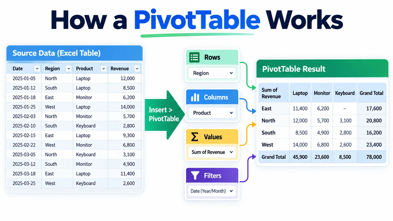
The four main layout areas are:
| Area | Purpose | Example |
|---|---|---|
| Rows | Creates categories down the report | Project, Region, Owner |
| Columns | Creates categories across the report | Month, Quarter, Status |
| Values | Calculates or summarizes numeric information | Sum of Budget, Count of Tasks |
| Filters | Filters the entire PivotTable | Department, Year, Program |
Microsoft notes that Excel commonly places non-numeric fields in Rows, date/time fields in Columns, and numeric fields in Values, although you can manually drag fields into any appropriate area.
Simple PivotTable Example: Sales by Region
Imagine this source data:
| Date | Region | Product | Salesperson | Revenue |
|---|---|---|---|---|
| 1 Sep | North | Product A | Sarah | 1200 |
| 2 Sep | South | Product B | Mike | 900 |
| 3 Sep | North | Product B | Sarah | 1500 |
| 4 Sep | West | Product A | Priya | 1100 |
To summarize revenue by Region:
- Drag Region to Rows.
- Drag Revenue to Values.
The PivotTable can then summarize the revenue for North, South, West, and any other regions in the source data.
How to Change Sum to Count, Average, or Another Calculation
Excel does not always use the calculation you want by default. A numeric field may be summarized as Sum, while a text field is typically counted.
To change the calculation:
- Select a value inside the PivotTable.
- Open the Value Field Settings.
- Choose the required summary function.
Common options include:
- Sum
- Count
- Average
- Max
- Min
For example, a project manager might use:
- Count of Risk ID to count risks
- Sum of Budget to total budgets
- Average of Cycle Time to calculate average duration
How to Add Multiple Fields to a PivotTable
A PivotTable becomes more useful when you combine fields.
For example:
- Rows: Region
- Columns: Product
- Values: Sum of Revenue
- Filters: Year
This lets you compare products across regions while filtering the entire report by year.
How to Sort and Filter a PivotTable
You can sort PivotTable items alphabetically or by values.
For example, you can sort regions from highest to lowest revenue to identify the strongest contributors.
You can also filter:
- Row labels
- Column labels
- Report filters
- Values
This makes PivotTables useful for exploratory analysis without changing the underlying dataset.
How to Group Dates in a PivotTable
When Excel recognizes a field as a date, you can often group dates into larger periods such as months, quarters, or years.
This is useful for trend analysis.
For example, daily sales transactions can be summarized as:
Year > Quarter > MonthIf Excel does not treat the field as a date, check the source data for text values, blanks, or inconsistent formats.
How to Show Values as Percentages
PivotTables can show the same underlying measure in different ways.
Examples include:
- % of Grand Total
- % of Row Total
- % of Column Total
- Difference From
- Running Total
This is useful when absolute values do not tell the full story.
For example, instead of showing only that Region A generated €50,000, you can show that it represented 32% of total revenue.
How to Refresh a PivotTable
If the source data changes, the PivotTable may need to be refreshed before it reflects the latest information.
A reliable manual method is:
- Click inside the PivotTable.
- Use the PivotTable Analyze tab.
- Select Refresh.
You can also right-click inside the PivotTable and choose Refresh.
For workbooks containing several PivotTables, use Refresh All when appropriate.
Microsoft documents newer automatic-refresh behavior for some Excel versions and data-source scenarios, but availability and defaults can vary. Manual Refresh remains an important skill when accuracy matters.
How to Update the PivotTable Source Data
If your source range changes significantly, you may need to update the data source.
Select the PivotTable, then use the PivotTable Analyze tools to change the source data.
Using an Excel Table as the source can reduce this maintenance because the Table can expand as new rows are added.
PivotTable vs Excel Formulas
| Need | PivotTable | Formulas |
|---|---|---|
| Quickly summarize a large table | Excellent | Possible, but more setup |
| Explore categories interactively | Excellent | Less flexible |
| Create a fixed calculation inside a model | Not always ideal | Excellent |
| Return one specific value | Possible | Often simpler |
| Change the analysis by dragging fields | Excellent | Not applicable |
PivotTables and formulas are complementary rather than competing tools. Use the Excel Formulas and Functions guide when you need reusable calculations, logic, or lookups inside the workbook.
How Project Managers Can Use PivotTables
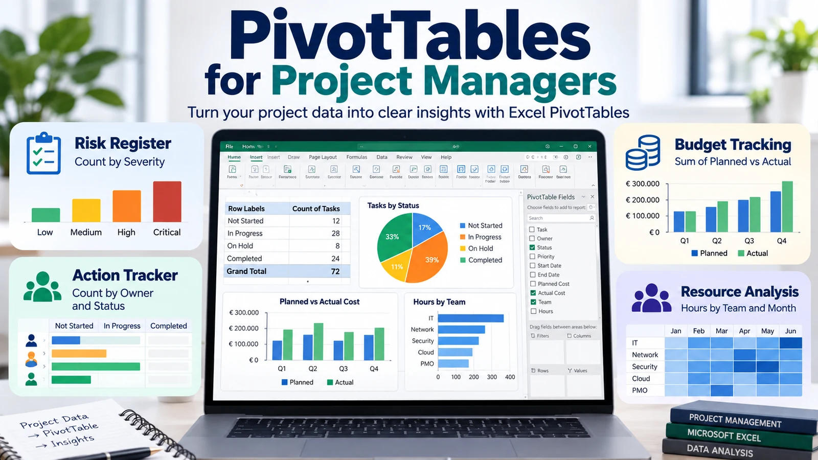
PivotTables are particularly useful for project and program reporting because many project datasets contain repeated categories.
Risk Register
Rows: Risk Category
Columns: Severity
Values: Count of Risk ID
This gives a quick view of where the risk concentration sits.
Action Tracker
Rows: Owner
Columns: Status
Values: Count of Action ID
This can show how many actions each owner has Open, In Progress, or Complete.
Budget Tracking
Rows: Workstream
Values: Sum of Planned Budget and Sum of Actual Cost
This can support a high-level comparison between planned and actual spending.
Resource Analysis
Rows: Team
Columns: Month
Values: Sum of Allocated Hours
This can reveal workload patterns across time.
Common PivotTable Mistakes
1. Using Blank or Duplicate Column Headers
Every source column should have a clear and unique field name.
2. Mixing Data Types in One Column
Text inside a numeric field can affect calculations and grouping.
3. Forgetting to Refresh
A report can look correct while still showing older source data.
4. Including Totals Inside the Source Data
If your source already contains manually calculated total rows, the PivotTable may count or sum them again. Prefer clean transaction-level data.
5. Using Merged Cells in the Dataset
Merged cells are useful for presentation but are not a good foundation for structured analytical data.
6. Assuming a Count Is a Sum
If Excel uses Count when you expected Sum, inspect the source field for text or non-numeric values.
7. Building a PivotTable from an Unstable Range
If rows will be added frequently, an Excel Table is usually easier to maintain than a manually selected fixed range.
How to Create a PivotTable in Excel: Best Practices
- Keep source data in a clean tabular structure.
- Use one header row.
- Use an Excel Table when the dataset grows regularly.
- Give fields short, clear names.
- Refresh before sharing or presenting results.
- Check whether Values are summarized as Sum, Count, Average, or another method.
- Keep the analysis readable: not every field belongs in one PivotTable.
- Create separate PivotTables for different business questions when necessary.
Frequently Asked Questions About PivotTables
Does a PivotTable change the original data?
Normally, no. The PivotTable creates a report based on the source data rather than rewriting the source rows.
Why is my PivotTable counting instead of summing?
Excel may detect the field as text or encounter non-numeric values. Check the source column and then choose the correct Value Field Settings.
Why does my PivotTable not show new rows?
The PivotTable may need to be refreshed, or the source range may not include the new rows. Using an Excel Table can make expanding datasets easier to manage.
Can a PivotTable use more than one field?
Yes. You can combine multiple fields across Rows, Columns, Values, and Filters.
Can I create charts from a PivotTable?
Yes. Excel supports PivotCharts connected to PivotTable analysis. Changes to the associated PivotTable can affect the PivotChart and vice versa.
Should I learn PivotTables before Power Query?
For many users, PivotTables are a good first analytical tool because they summarize structured data quickly. Power Query becomes especially useful when the repeated challenge is importing, cleaning, combining, or transforming data before analysis.
Continue Learning
Final Takeaway
Learning how to create a PivotTable in Excel gives you a fast way to summarize structured data without building a large set of formulas.
The core workflow is simple:
- Prepare clean tabular data.
- Select the source.
- Choose Insert > PivotTable.
- Place fields into Rows, Columns, Values, and Filters.
- Adjust the summary calculation.
- Sort, filter, group, and format the report.
- Refresh the PivotTable when the source data changes.
Once this workflow feels natural, you can use PivotTables as a foundation for more advanced Excel analysis, dashboards, and reporting.