
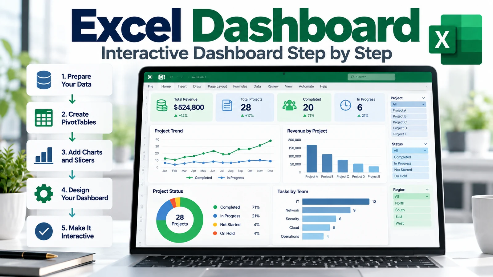
An Excel dashboard brings key metrics, charts, filters, and trends together in one place so users can understand performance without reading through multiple worksheets. A well-designed dashboard turns structured data into a compact decision-support view that is easier to explore and explain.
This step-by-step guide shows you how to build an Excel dashboard using clean source data, Excel Tables, PivotTables, PivotCharts, slicers, timelines, formulas, and conditional formatting. It also explains how to design a dashboard that remains understandable, refreshable, and useful for real project and business reporting.
If you are following the TechTeamSynergy Excel learning path, start with the Microsoft Excel Learning Hub. Use Power Query in Excel to prepare recurring data, PivotTables to summarize it, Conditional Formatting to surface exceptions, and Excel Formulas & Functions for calculations and KPI logic.
Microsoft’s official guidance describes an Excel dashboard as a visual representation of key metrics that lets users view and analyze data in one place. Microsoft also demonstrates a dashboard workflow based on PivotTables, PivotCharts, slicers, and timelines. See the official guides for creating an Excel dashboard, creating PivotCharts, and using slicers to filter data.
What Is an Excel Dashboard?
An Excel dashboard is a worksheet or workbook view designed to summarize important information visually.
Typical dashboard elements include:
- KPI cards
- Charts
- PivotCharts
- PivotTables
- Slicers
- Timelines
- Conditional formatting
- Trend indicators
- Short explanatory labels
The objective is not to place every available metric on one screen. A useful Excel dashboard focuses attention on the information users need to monitor, compare, or act on.
What Makes a Good Excel Dashboard?
A good dashboard should answer a small number of important questions quickly.
For example:
- Are we on target?
- What has changed?
- Where are the exceptions?
- Which category needs attention?
- What is the trend over time?
- Which project, region, team, or product is driving the result?
Before building charts, define the decisions the dashboard should support.
Excel Dashboard Architecture
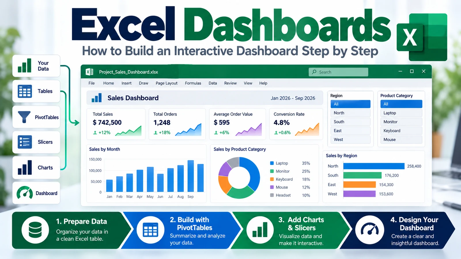
A reliable dashboard usually has several logical layers:
- Source Data — raw or imported records.
- Data Preparation — cleaning, standardizing, and combining data.
- Analysis — formulas, PivotTables, or calculations.
- Visualization — charts, KPI cards, conditional formatting.
- Interaction — slicers, timelines, and filters.
- Dashboard — the final user-facing worksheet.
A practical architecture is:
Source Data
↓
Power Query / Clean Tables
↓
PivotTables + Formulas
↓
PivotCharts + KPI Cards
↓
Slicers + Timeline
↓
Dashboard
Step 1: Define the Dashboard Objective
Start by defining:
- Who will use the dashboard?
- What decisions should it support?
- Which KPIs matter?
- How often will the data refresh?
- Which filters are useful?
- Which time period should be visible?
A dashboard for a project steering committee will not need the same level of detail as an operational tracker used every day.
Step 2: Prepare Clean Source Data
Dashboards depend on reliable data structure.
Your source table should generally have:
- One header row
- One record per row
- One field per column
- Consistent data types
- No merged cells inside the dataset
- No unnecessary blank rows
- Stable category labels
For recurring imports and cleanup, use the Power Query in Excel guide. Power Query is especially useful when the same transformation process must be repeated each reporting cycle.
Step 3: Convert the Source Range to an Excel Table
Excel Tables help keep data structured and easier to reference.
Select the source data and use:
Insert > Tableor, in common desktop Excel environments:
Ctrl + TGive the table a meaningful name such as:
ProjectData
SalesData
PortfolioData
A named table is easier to understand than an anonymous cell range.
Step 4: Build the Calculations and KPIs
Decide which metrics belong on the dashboard. If you are still defining the measurement model, our KPI vs OKR guide explains how to separate operational performance indicators from strategic objectives and key results before visualizing them.
Examples include:
- Total Revenue
- Actual Cost
- Budget Variance
- Completion Percentage
- Open Risks
- Overdue Tasks
- Customer Satisfaction
- Utilization
- On-Time Delivery
You can calculate KPIs with formulas, PivotTables, or both.
For example:
=ActualCost-PlannedCostor:
=COUNTIF(StatusRange,"Overdue")For more formula patterns, see the Excel Formulas & Functions guide.
Step 5: Create PivotTables for the Dashboard
PivotTables are useful when the dashboard needs flexible summaries by category, time period, owner, region, project, or status.
For example, you might create separate PivotTables for:
- Revenue by Region
- Tasks by Status
- Risk Count by Severity
- Budget by Project
- Monthly Trend
Keep these PivotTables on a separate analysis worksheet rather than placing them directly inside the dashboard layout.
See How to Create a PivotTable in Excel for the complete setup process.
Step 6: Create PivotCharts
Microsoft describes PivotCharts as graphical representations connected to PivotTables. Changes to the associated PivotTable can be reflected in the PivotChart, which makes them useful for interactive dashboard reporting.
To create one:
- Select a cell in the PivotTable.
- Go to Insert > PivotChart.
- Select an appropriate chart type.
- Place and format the chart.
Choose the Right Chart
| Question | Useful Chart Type |
|---|---|
| How is a metric changing over time? | Line chart |
| How do categories compare? | Bar or column chart |
| Actual vs target? | Column, bar, or combo chart |
| What is the composition? | Stacked bar or column |
| What are the top performers? | Sorted horizontal bar |
Avoid choosing a chart because it looks interesting. Choose the chart that makes the comparison easiest to understand.
Step 7: Add Slicers to the Excel Dashboard
Slicers add clickable filter buttons to tables and PivotTables. Microsoft notes that slicers show both the filtering controls and the current filtering state, making them useful for interactive exploration.
Typical slicers include:
- Region
- Project
- Owner
- Department
- Status
- Product
- Customer
To add a slicer to a PivotTable:
- Select the PivotTable.
- Go to PivotTable Analyze > Insert Slicer.
- Select the required fields.
- Arrange the slicers on the dashboard.
Step 8: Connect One Slicer to Multiple PivotTables
A dashboard becomes more useful when one slicer filters several PivotTables and charts at the same time.
Microsoft’s dashboard guidance uses Report Connections to connect slicers to multiple PivotTables.
A common workflow is:
- Select the slicer.
- Open Report Connections.
- Select the PivotTables that should respond.
- Test the filter.
This lets a single Region or Project filter update multiple dashboard visuals together.
Step 9: Add a Timeline for Date Filtering
A Timeline is useful when users need to filter dashboard data by date periods.
Examples:
- Year
- Quarter
- Month
- Day
Timelines are especially useful for management dashboards because they provide a simple way to move through reporting periods.
Step 10: Build KPI Cards
KPI cards show a small number of high-priority metrics prominently.
For example:
| KPI | Value |
|---|---|
| Portfolio Completion | 76% |
| Open Risks | 18 |
| Budget Variance | -3.2% |
| Overdue Actions | 7 |
A KPI card should normally include:
- Metric name
- Current value
- Optional target
- Optional variance
- Optional status signal
Step 11: Use Conditional Formatting for Exceptions
Conditional formatting can make important deviations easier to spot.
Examples include:
- Red for overdue actions
- Amber for risks requiring attention
- Green for targets achieved
- Data bars for progress percentages
- Icons for trend direction
Use the Conditional Formatting in Excel guide for formulas, thresholds, dates, icons, and other rule types.
Step 12: Design the Dashboard Layout
A simple dashboard layout might use:
Top row: KPI cards
Second row: Slicers / Timeline
Middle: Main trend chart
Lower section: Category comparisons
Bottom: Supporting detail or notes
Keep the most important information near the top-left or top-center, where users naturally begin scanning.
Excel Dashboard Design Principles
Use a Consistent Visual Hierarchy
Major KPIs should be more visually prominent than secondary metrics.
Limit Colors
Use color to communicate meaning, not decoration.
Avoid 3D Charts
3D effects can make comparisons harder to read.
Keep Labels Clear
Use meaningful titles such as:
Monthly Revenue Trend
Open Risks by Severity
Budget Variance by Project
Avoid generic titles such as “Chart 1.”
Reduce Visual Clutter
Remove unnecessary borders, excessive gridlines, redundant legends, and decorative elements that do not help interpretation.
Example: Project Management Dashboard in Excel
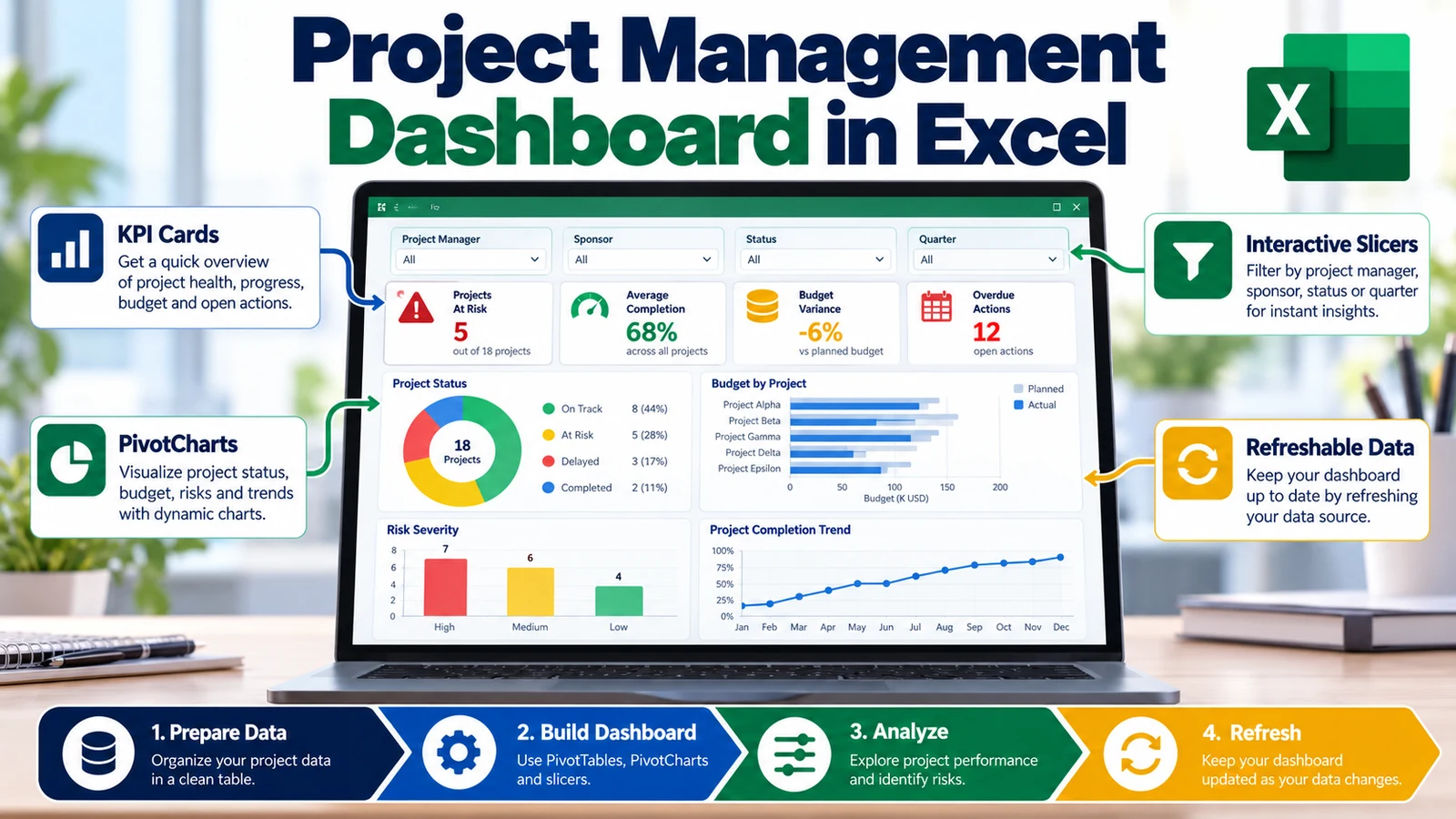
Suppose a project portfolio dataset includes:
Project
Sponsor
Project Manager
Status
Start Date
End Date
Planned Cost
Actual Cost
Completion %
Open Risks
Overdue Actions
A useful project dashboard could contain:
KPI Cards
- Total Projects
- Projects At Risk
- Average Completion
- Budget Variance
Charts
- Projects by Status
- Budget by Project
- Risk Count by Severity
- Completion Trend
Filters
- Sponsor
- Project Manager
- Status
- Timeline by Month or Quarter
This gives stakeholders a compact view while still allowing them to explore the portfolio interactively.
Excel Dashboard Refresh Workflow
A dashboard should have a clear refresh process.
For recurring reporting, a strong workflow is:
New Source Files
↓
Refresh Power Query
↓
Refresh PivotTables
↓
Charts Update
↓
Validate KPIs
↓
Publish Dashboard
Always validate the dashboard after refresh. Automation reduces manual work, but users should still verify that the source data, filters, totals, and reporting period are correct.
Common Excel Dashboard Mistakes
Too Many Metrics
If everything is important, nothing stands out.
Too Many Chart Types
Consistency improves readability.
Mixing Raw Data with Dashboard Presentation
Keep raw data and analysis on separate worksheets when possible.
Using Manual Copy-and-Paste Every Reporting Cycle
If the workflow repeats, investigate whether Power Query can automate the data-preparation layer.
Broken Slicer Connections
Test that every slicer controls the intended PivotTables and charts.
Using Colors Without Meaning
Define a clear color language and keep it consistent.
Not Testing the Dashboard After Refresh
Always confirm that the latest data is loaded and the totals remain reasonable.
Excel Dashboard Best Practices
- Start with the business question.
- Use clean, structured source data.
- Separate source, analysis, and presentation layers.
- Use Power Query for repeatable cleanup.
- Use PivotTables for flexible summaries.
- Use PivotCharts for interactive visualization.
- Use slicers and timelines selectively.
- Keep the layout simple.
- Use consistent colors and typography.
- Validate every refresh.
- Document the data source and reporting period.
Frequently Asked Questions About Excel Dashboards
Can Excel create interactive dashboards?
Yes. PivotTables, PivotCharts, slicers, timelines, formulas, and conditional formatting can be combined to create interactive dashboard-style reports.
Do I need Power Query to build an Excel dashboard?
No, but Power Query can make the data-preparation layer much more repeatable when you import and clean recurring source data.
Should I use PivotCharts or regular charts?
Use PivotCharts when the visual should respond to PivotTable fields and filters. Regular charts can be better for simpler formula-driven models.
Can one slicer control multiple charts?
A slicer can control multiple PivotTables when the appropriate report connections are configured. PivotCharts linked to those PivotTables then respond to the same filtering context.
Can I build a project management dashboard in Excel?
Yes. Excel can be used for project KPIs such as status, budget variance, risks, overdue actions, milestone progress, and resource indicators.
Should the dashboard be on the same sheet as raw data?
Usually no. Separating raw data, analysis, and presentation improves readability and maintainability.
Continue Learning
Final Takeaway
An Excel dashboard works best when the underlying data is clean, the KPIs are relevant, and the visual design stays focused on decisions rather than decoration.
A practical build sequence is:
Define the Goal → Prepare the Data → Build KPIs → Create PivotTables → Add Charts → Add Slicers → Design the Dashboard → Refresh and ValidateStart with a simple dashboard that answers a few important questions well. Once the structure is reliable, you can add more interactivity without making the workbook harder to understand.